Alright, alright. Do you want to chat about a shoot that has my heart? Here it is. This day did not have one missing detail. Not one. Each time I look at the gorg gallery, I notice something new that I love. I, unfortunately, didn’t get to be there on the day of to witness the pure magic firsthand, but I am sure that if I had been, I’d *somehow* be even more jazzed about the outcome (which, in reality, I’m not sure how could even be possible).
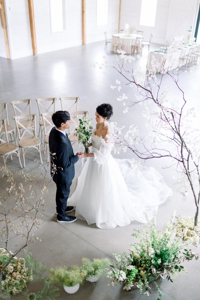
This shoot took place in the exquisitely chic, Northern Haus, nestled in Wisconsin’s beautiful Door County. I will share lots of the gorgeousness that is SURE to give you all the giddy feels for inspo below, but first, let’s chat about the stationery details that I was lucky enough to contribute. Which, if I do say so myself, just might give you some inspo too. 😉

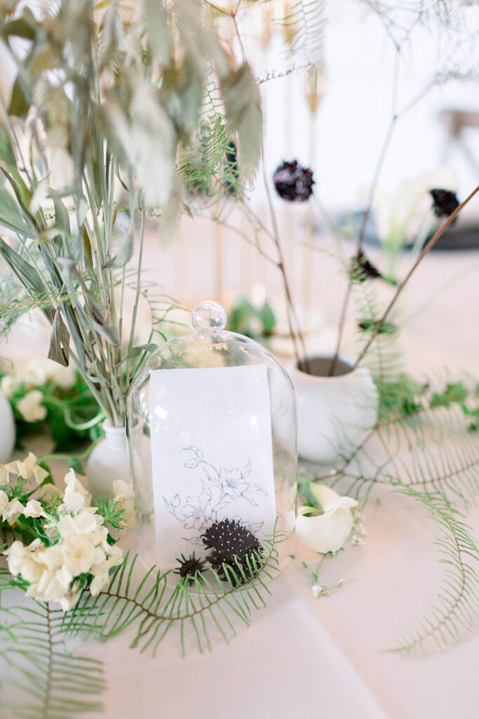
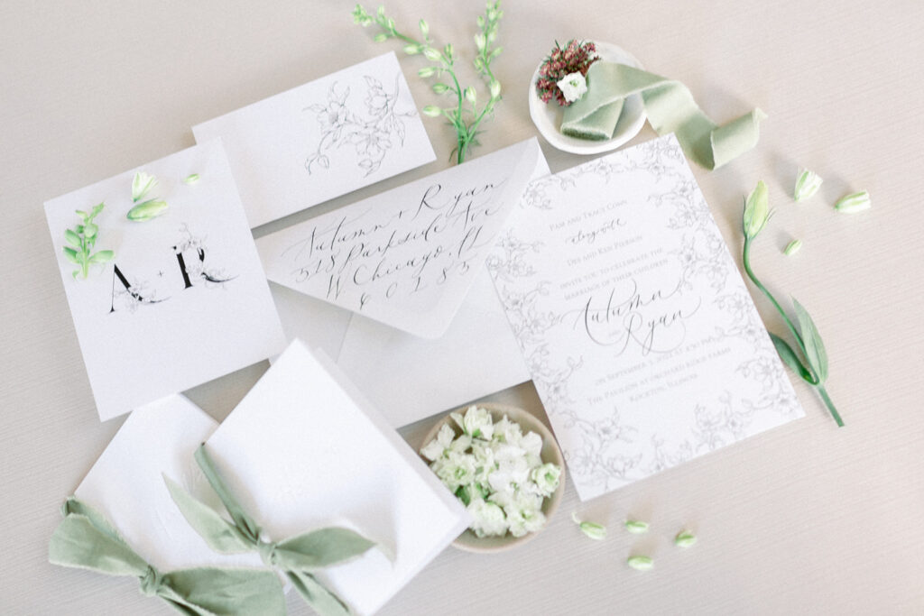
To start this design, I drew up a floral pattern that I decided would be incorporated throughout the suite. This was the touchstone that I used throughout the design process. I saw this monoline floral design as minimalist, chic, and elegant and I wanted the whole suite to give that feel.
When creating custom stationery, it’s important to me to think about the elements that are unique and important for that specific couple and event. It’s important that the details draw upon and highlight the unique qualities of the people and places they’re made for.
This is what makes a statement. This is what makes a true keepsake.
Unlike the mass-produced, same-old stationery your cousin Terry can get his hands on from Minted, we’re creating a piece of art, that captures a memory. One that encompasses YOU and your love story, knowing it is unlike any and all others. Hear me out – I am NOT here to shoot down Minted or the mass-produced invitation companies. Different strokes for different folks. I’m just here to say, you and your love are unique and worth highlighting in the one-of-a-kind details.
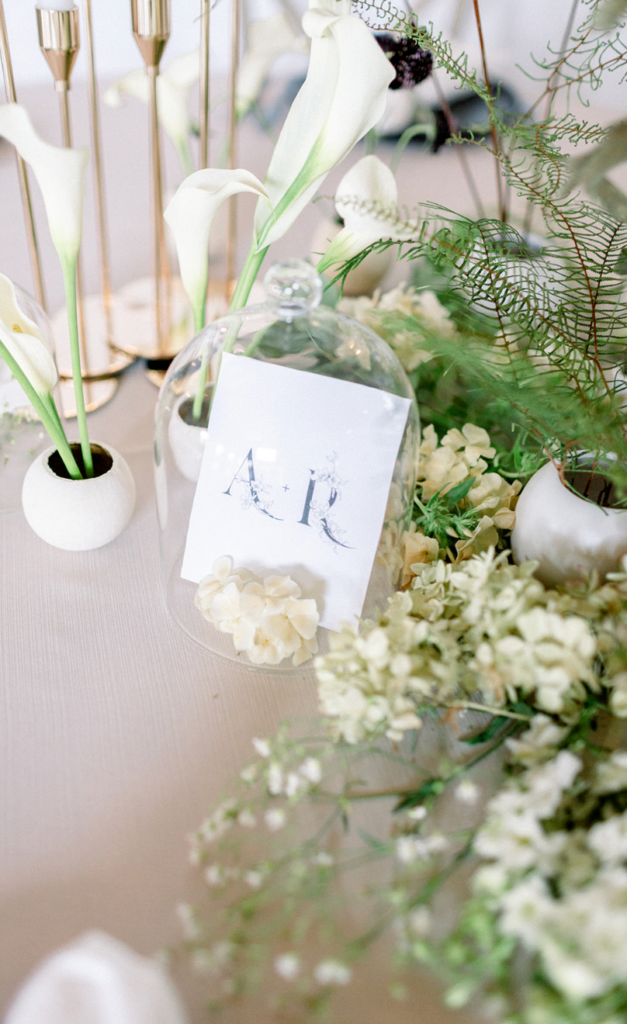
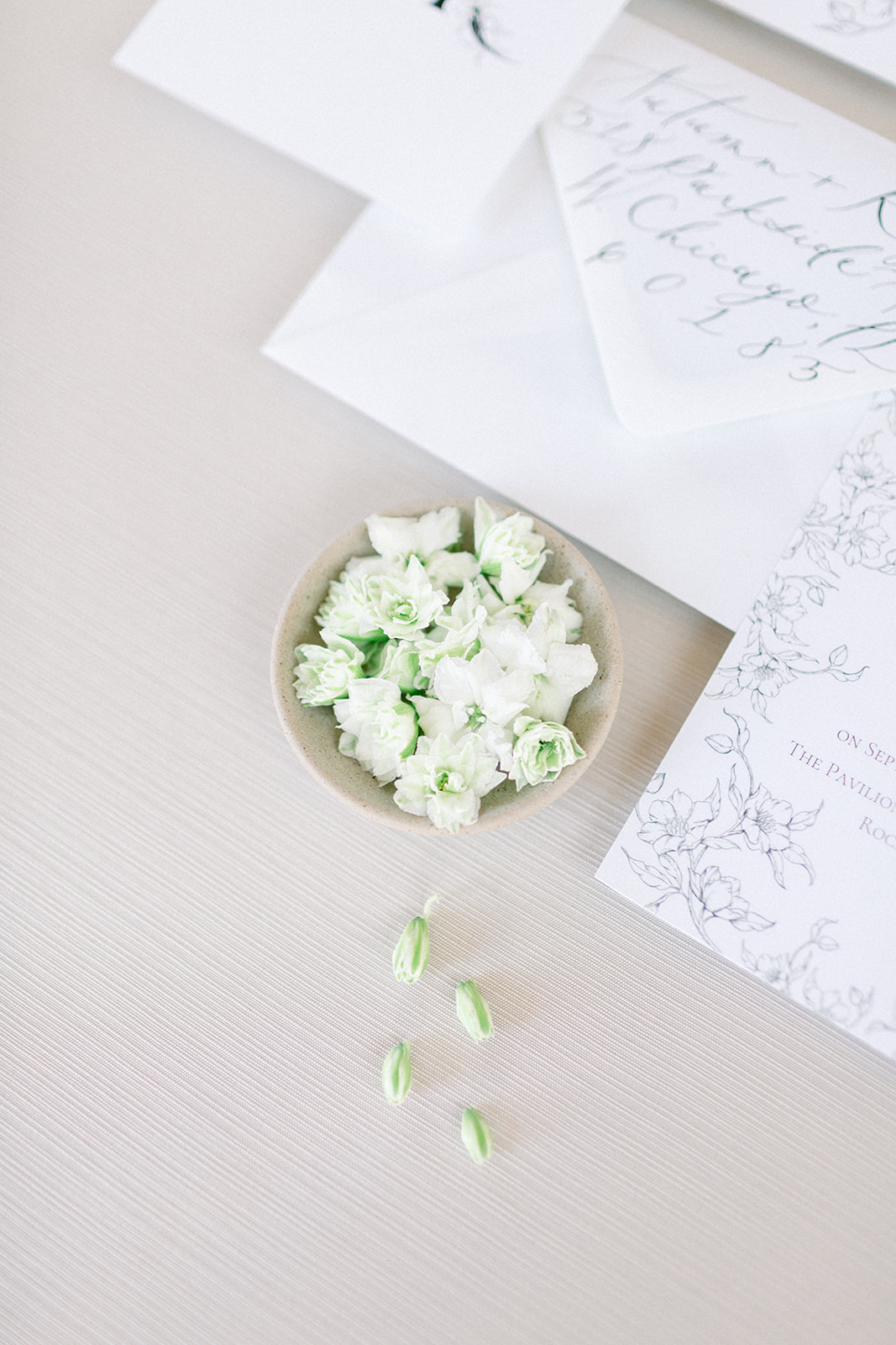
OKAY, rant over. Back to the design. I knew this shoot was going to be very floral heavy, and I wanted to make sure that was translated into the details of the paper suite. I gave the main invitation a statement by bordering it entirely with the floral pattern, incorporated it into the specially made monogram, and added a floral embellishment on the back of the RSVP card. The swanky calligraphy style alongside the beautiful sage green and crisp white color palette was the perfect tie-in.
Speaking of keepsakes, I am not sure there is anything more special than the keepsake of your vows and promises to one another, embarking on the new and beautiful adventure of your marriage. These blind letterpress printed vow books, customized with the simple and oh-so-elegant sage bow are seriously special. Just imagine, every anniversary pulling these beauties out and reminiscing by rereading your vows to one another. So sweet. I will say, MUCH better than the scraps of paper that are tucked away in my wedding memory box (a serious disgrace!!!) or the note in your iPhone. Yikes.
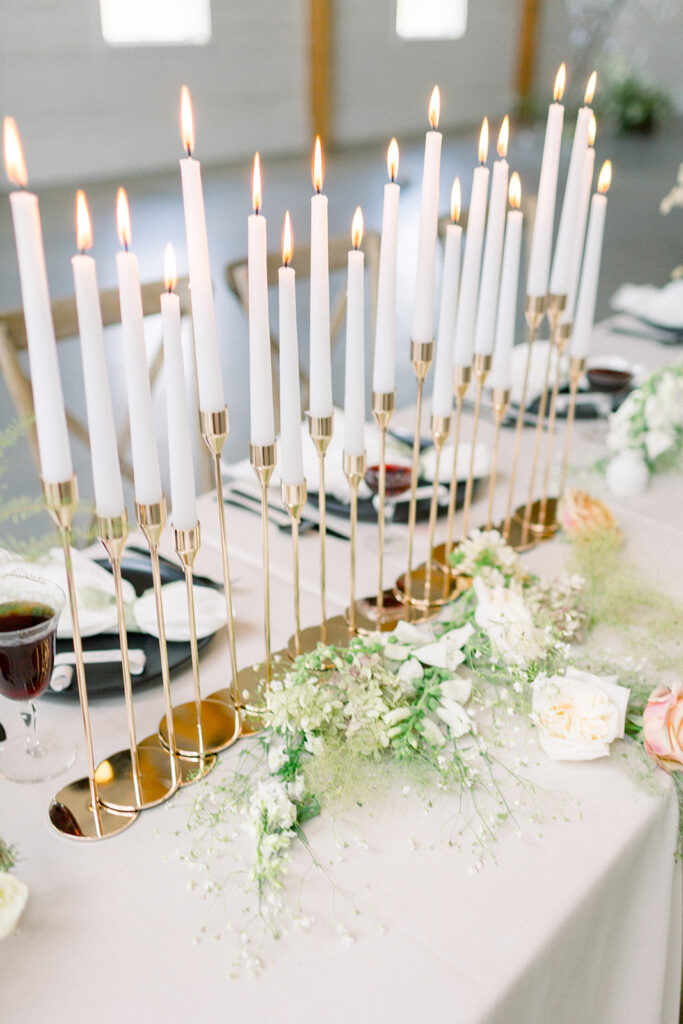
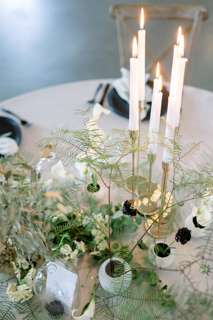
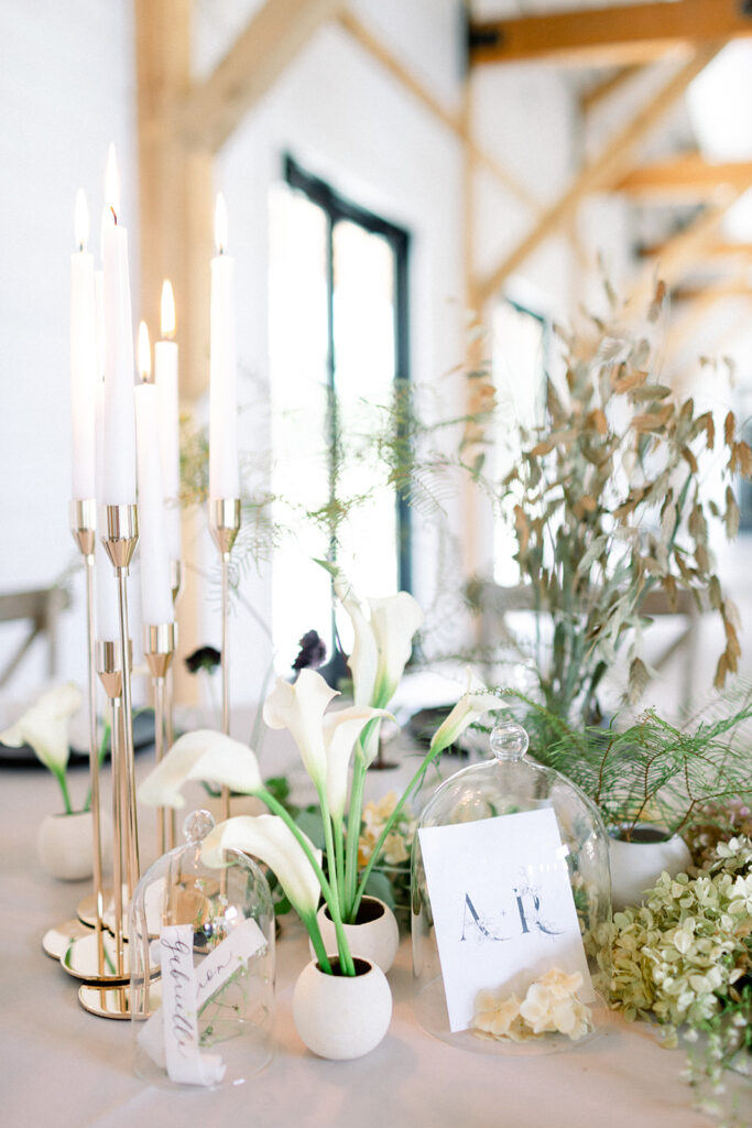
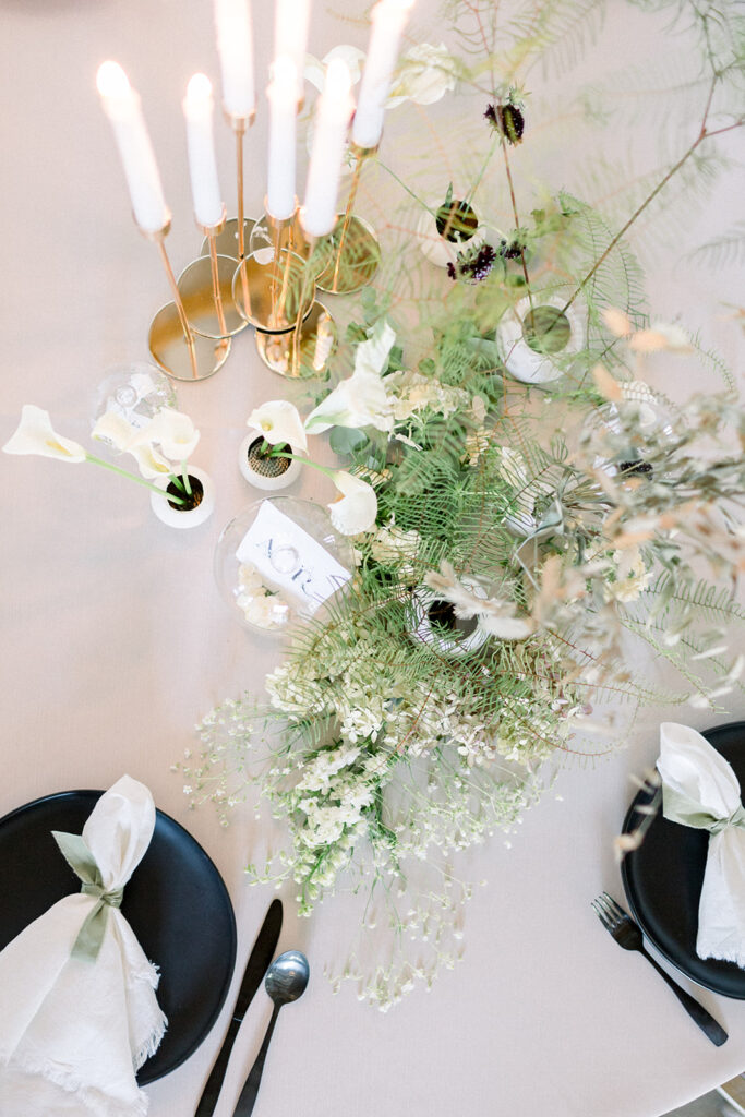
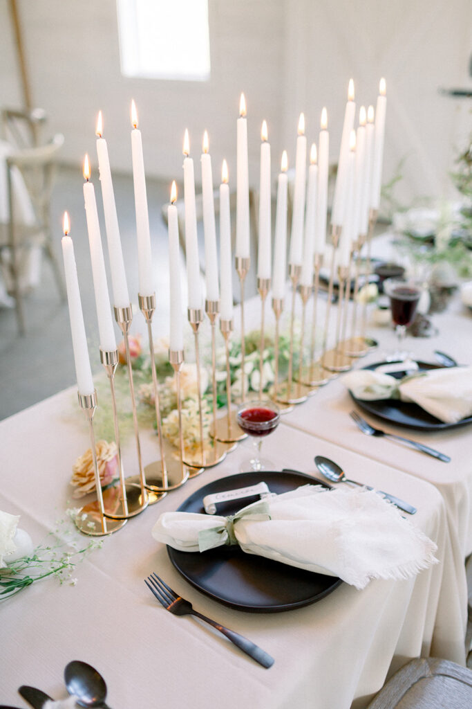
Now, oftentimes I send off the details I make, unsure of how they’ll be set up and put to use. I often find myself crossing my fingers and toes hoping that the little babies will find their way to the cutest of setups and styling. But in this case, Renee Breanne Design and Steph Kadlicko were in charge… And let me tell you, they are the pros of all pros. They stepped out of the box in ALL of the best ways when setting up these tablescapes. I am beyond obsessed with the couple’s unique monogram displayed in the glass cloche on each table. A fun and unique way to put the monogram to more use! Also, check out all of those candles. Can you say AMBIANCE?
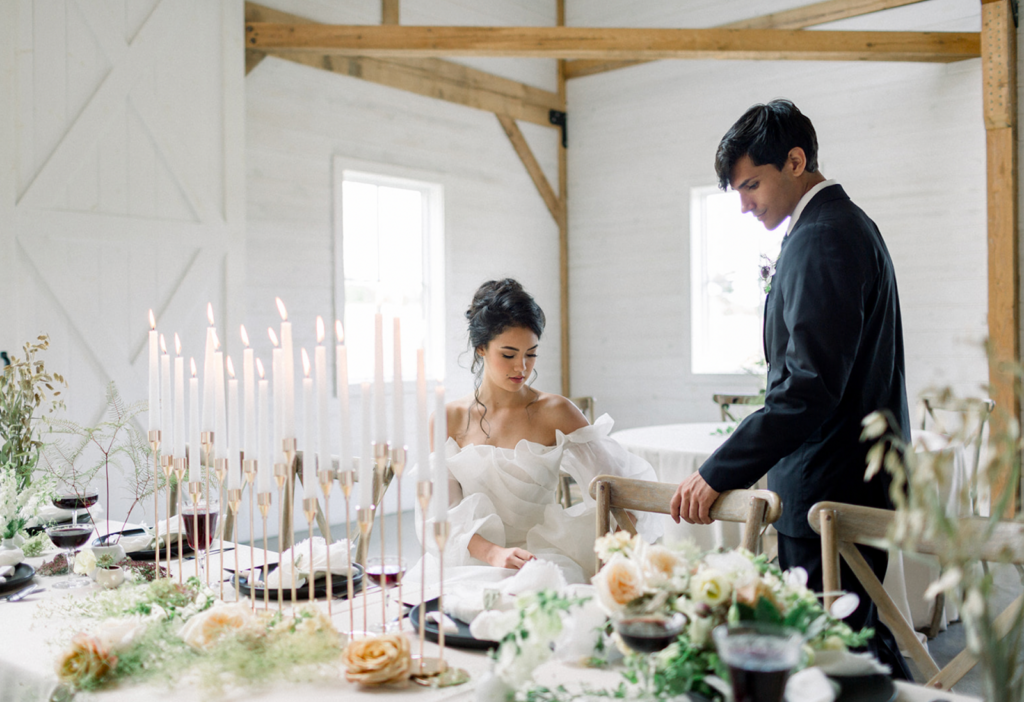
One of the simplest ways to have your table settings scream romantic elegance is through the delicately curled place cards, handwritten in calligraphy. Simply stunning, and one of my absolute favorites.
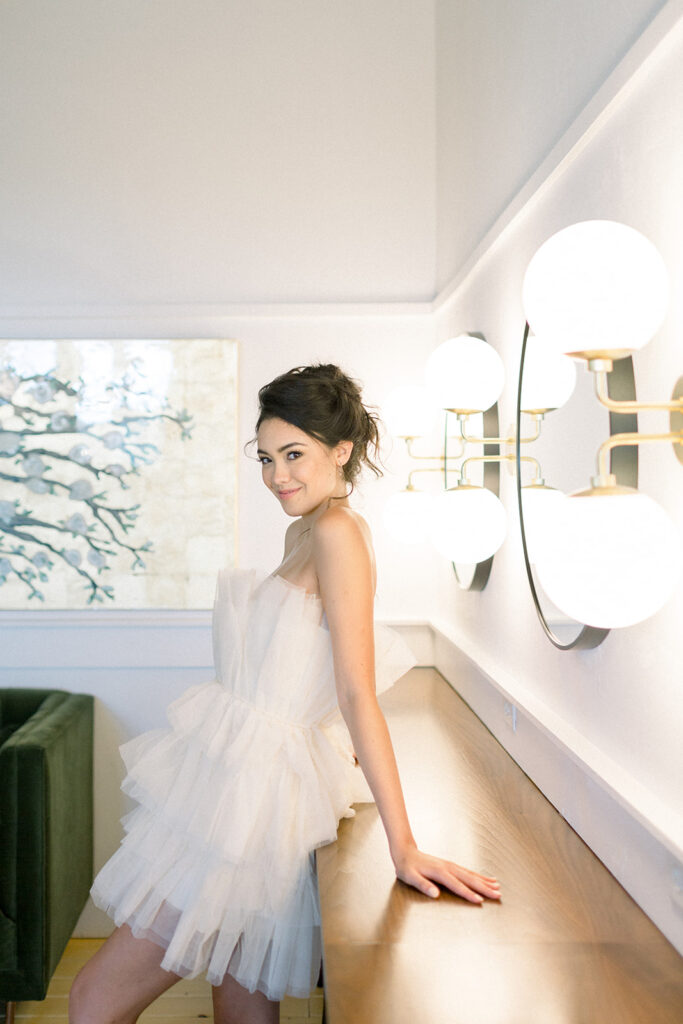
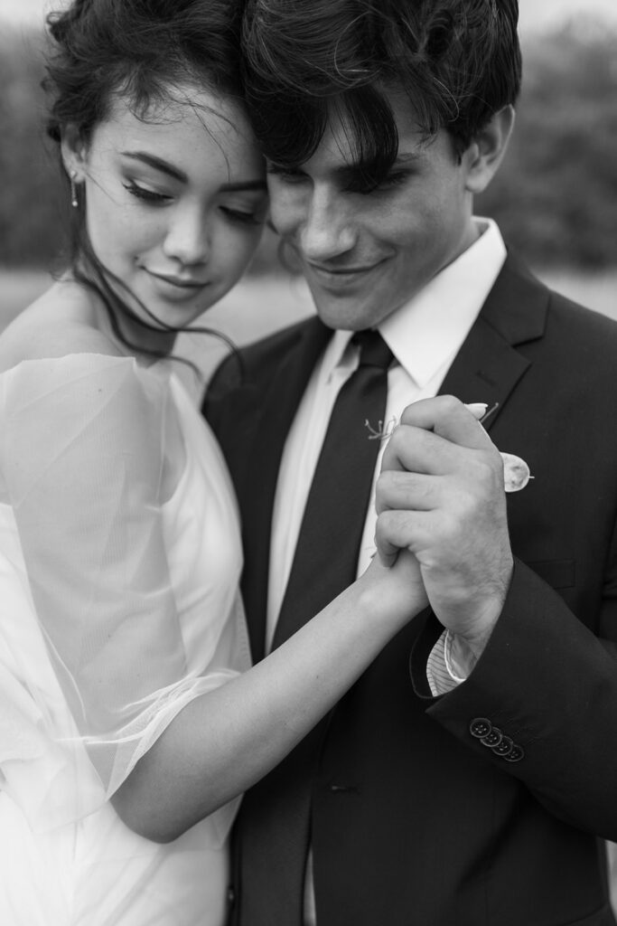
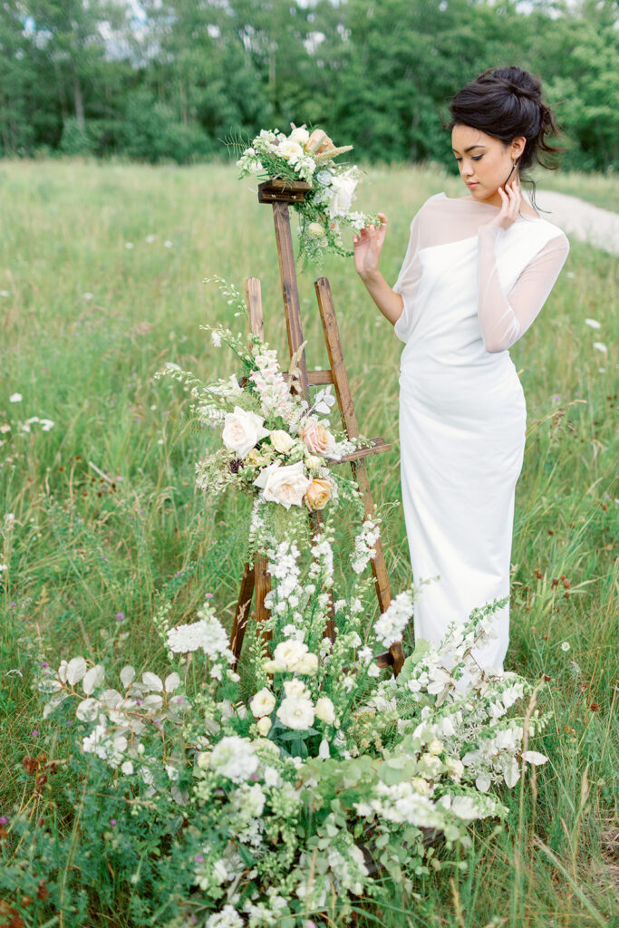
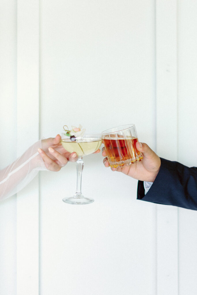
And now, to wrap up this stunner of a shoot, I now give you some of my fave photos from this shoot. Get ready, it’s good. If you love what you see, check out the list of vendors that helped contribute their awesome talents to make this come together so gorgeously!
As always, thanks for being here, and thanks for reading.
xx, shi
Venue || The Northern Haus
Planning and Design || Renee Breanne Design
Photo || 5th Photography – Steph Kadlicko
Art Direction || Renee Breanne Design and Steph Kadlicko
Gown Boutique || Gigi MKE Boutique
Gown Designer || Monique Lhuillier
Florist || Atmospheric Floral
Hair and Makeup || Sara Miller Makeup
Stationery || Lettered by Shi
Linens || BBJ La Tavola



< back to blog library
Posted by:
Shi Norman
Hey, it's Shi!
Let me first tell you how happy I am that you’re here. I have many passions and I am grateful to be able to bring many of them into my daily life. I have always been creative, but never knew what my niche was until I met calligraphy. When I am not at my desk creating, I work as a Bilingual Resource Teacher in an elementary school (my second language is Spanish!). I also love spending quality time with my people, reading, cooking, exercising, or enjoying the outdoors.
my story
Service Inquiry
Please complete the form below & I will be in touch very soon!
HOME
ABOUT
SERVICES
blog
EXPERIENCE
CONTACT
© Lettered By Shi 2023-2025. All Rights Reserved. Site Credit.
inquire with me
Portfolio